Posts Tagged ‘Android’
June 1st, 2009
As described in an earlier post, Android is not friendly to mocking frameworks or mock-style testing. If you want to test any class in your application that deals with the Android API, it’s best to run your tests through the emulator, accessing real Android classes. It’s unfortunate because you’re not just testing your application. You’re also testing Android. Anyway, here’s a way to mock a UI component.
If you’re just starting, here are a couple notes to keep you on the right track.
- Android is bundled with JUnit 3. Don’t try using an updated JUnit library or another testing framework. The Android jar doesn’t contain any functional code, so all test cases have to be run in the emulator, which uses JUnit 3. The test framework that will work best is in the Android API.
- If you need basic implementations of Android classes, try to avoid mocking them.
“Mock”ing
In my latest test, I needed a TextView so that I could call the simplest method, setText(String). I’ll describe how I got one.
Don’t bother with the android.test.mock package. It just contains implementations of classes that throw UnsupportedOperationExceptions. There isn’t anything there that I have yet found useful.
- In the test case, instead of extending TestCase, extend at InstrumentationTestCase or, if necessary, one of its subclasses. It’ll set up most of the stuff that’s available in an Activity and make it available to your test case.
public class AnAndroidTest extends InstrumentationTestCase {
- Create a mock implementation of TextView or the class you need.
public class MockTextView extends TextView {
  public MockTextView(final Context context) {
    super(context);
  }
}
- The TextView constructor needs a real Context object because it will call methods on it. The context is difficult to mock because parts of it are private to Android. Since the Android JAR is just an API and doesn’t have any functional code, you couldn’t even see the methods if you tried. They only exist in the VM in the emulator. AFAIK, if you can’t see a method, you can’t mock it. That’s why your test case extends InstrumentationTestCase. Put this in it.
final TextView textView = new MockTextView(this.getInstrumentation().getContext());
Now write the test case. The text view is real and has a fully functional context, so the emulator will have everything it needs to support your test case.
May 30th, 2009
* I stand corrected. A commenter, Kiran Gunda, says it’s possible to mock f inal methods with JMockIt. I may have set the mock up incorrectly. If I try again, I’ll update this post. Until then, an updated post describes how I used Android test classes to run my code. Matt also pointed out that JMock can mock final methods using JDave’s unfinalizer.
* Updated July 11, 2009 to remove some incorrect information
So that you don’t have to read this whole post, I’ll sumarize what I discovered. If you’re thinking about using a mocking library to mock Android classes, don’t. Android uses interfaces sparsely. That makes a clean API with lots of reusable code, but makes mocking difficult. The real problem, though, is caused by Android’s generous use of final methods. I don’t know of any mocking library that can mock final methods, so you just can’t do it. Instead of writing mocks, look into the android.test and android.test.mock packages.
I developed GreenMileage so that I could learn about the Android OS. Now that I have an understanding of it, I decided to go back and write test cases so that I could continue development using TDD. I started by writing tests for utility classes. That wasn’t a problem. After finishing that, I moved to some simple UI cases. The first was TextViewCallbackListener. I just had to mock TextView.setText(String).
First, I spent hours just trying to get the JMock jars into the project. For some reason, the compiler would not put JMock into the APK. I didn’t get any error message or notification. It just wasn’t there.
I decided to use Android’s test mocks to run my code. Click here to see a simple example.
April 27th, 2009
Green Mileage is now an open source application at Google Code. You can find the full source for most of the Android posts on this site in it at http://code.google.com/p/greenmileage/. Just click the Source tab, then the Browse link.
The code needs a lot of cleanup, but is still probably worth a look if you’re new to Android.
January 31st, 2009
Assigning an icon to your Android application just takes a minute. Actually creating the icon may take a bit longer. 😛
- Create a 48×48 PNG and drop it into /res/drawable. The name of this file is usually “icon.png”.
- Open your AndroidManifest.xml.
- Right under the root “manifest” node of the XML, you should see the “application” node. Add this attribute to “application”. (The “icon” in “@drawable/icon” refers to the file name of the icon.)
android:icon="@drawable/icon"
Your app is now iconned.
To support multiple resolutions, you can create icons of different resolutions and place them in the correct folders.
- Low density
- res/drawable-ldpi
- 36×36 resolution
- Medium density
- res/drawable-mdpi
- 48×48 resolution
- High density
- res/drawable-hdpi
- 72×72 resolution
- Extra high density
- res/drawable-xhdpi
- 96×96 resolution
January 31st, 2009
A lot of people have found this site by searching for an Android button tutorial, so here it is.
- This tutorial assumes that you already have an activity and are using an XML layout.
- Open the layout XML and add the button element. Assign an ID with the “@+id” operator. The + tells Android to generate an ID for this element so that you can reference it in your Java files.
- This is an example. Your layout and text elements will probably be very different. In this example case, the ID of the button is “close”.
<Button android:id="@+id/close"
    android:layout_width="fill_parent"
    android:layout_height="wrap_content"
    android:layout_alignParentBottom="true"
    android:text="@string/title_close" />
- Open the activity class. Add a class property to hold a reference to the button.
- If you haven’t already, override the onCreate method.
@Override
protected void onCreate(Bundle savedInstanceState) {
}
- For this example, we don’t need the saved instance state, so ignore it.
- Now, in the onCreate method, attach a listener to the click event for the button. This example will call “finish()” on the activity, the Android analog of clicking the close button on a window.
protected void onCreate(Bundle savedInstanceState) {
  this.setContentView(R.layout.layoutxml);
  this.closeButton = (Button)this.findViewById(R.id.close);
  this.closeButton.setOnClickListener(new OnClickListener() {
    @Override
    public void onClick(View v) {
      finish();
    }
  });
}
- Here’s a short description of what’s happening.
- First, get the button ID. The ID created earlier in the layout, “close”, is compiled by Android and assigned a unique integer ID which is available to the application through the “R” class, which I assume is short for “Resources”.
- Request a reference to the button from the activity by calling “findViewById”. The button has to be retrieved from the activity because while an ID is unique in an activity, it is not unique among all activities.
- Assign the retrieved button to an instance variable so that if you need it later, you can easily find it without having to query for it again.
- Create a class implementing “OnClickListener” and set it as the on click listener for the button.
As UI elements go, buttons are some of the simplest. Later, I’ll write about menus and dialogs, which aren’t so easy.
January 25th, 2009
This is part 2 of this tutorial. Click here to see part 1.
- You should have two shapes in Inkscape.


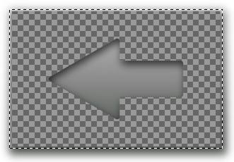
- Now, you have to get these into the GIMP. The easiest way is to take a screen shot. To do that, in GIMP, go to File -> Acquire -> Screen Shot. Take two shots. Crop one to the shadowed image and the other to the black and white.
- Pick the shadowed image and add an opaque layer mask. View the Layers dialog. Right click the “Background” layer and click Add Layer Mask…
- Pick the black and white image. Select the entire image and copy it.
- Pick the shadowed image and in the layers dialog, click on the mask, to the right of the image.
- Pick the shadowed image and paste. You should see something like the image below. Pick the move tool and drag the mask around until it exactly matches the shadowed arrow.

- Now, crop the image to the arrow shape.
- Right click on the floating layer and anchor it.
- Right click on the mask layer and apply it.
- Now, just save it! Remember to save it as a PNG so that the empty parts are transparent.

I hope this helps anyone else who needs more than the standard Android icons.
More updates:
Will S. created a wireless icon.
Great tutorial, and very easy to follow, thanks.
I made a wifi icon, which can be found here:
http://digitalsquid.co.uk/files/2009/08/wifiicon.png
(you can use it if you want)
January 24th, 2009
Update
The Android developer site has some great icon guidelines now. I recommend taking a look. If you have Photoshop or another program that supports vector shapes and drop-shadows, you can see the proper settings there.
Nick says
… you can do the whole thing in Inkscape without having to go into GIMP, by using a clip mask.
Duplicate your arrow, then select both this and the inverse arrow and do Object > Clip > Set. The inverse arrow will be clipped to only show the content contained within the arrow shape.
Introduction
For my Android application, Green Mileage, I created a number input dialog box. One of the buttons in the dialog is a backspace key. Right now, it’s just a button that says, “Back”. When typing, it’s function is not immediately intuitive, so I wanted to replace it with an ImageButton. To skip to the example, scroll down. Unfortunately, none of the Android icons look quite right. I found an image of a red X and a trash can. Neither would look like a backspace, so I decided to create my own.
Since Android is open source, I assumed that Google would have created some kind of template for button images. I thought I would find a PSD, but after much searching, could not. Rather than pay $1,000 for Photoshop, I decided to use open source applications to create the image. Here’s how I did it.
Step 1: Get Inkscape and GIMP
Since this drawing will be made with vector graphics, it’s best to use a vector graphics program, so head on over to Inkscape’s web site and download it if you don’t already have it. The post-processing will be done in GIMP, so grab a copy of that too. Both have versions for Linux and Windows.
Step 2: Create the Inkscape drawing
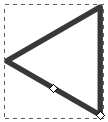
The points on the arrow should be evenly spaced, so they shouldn’t be drawn by hand. The arrow is really just a triangle with a rectangle dangling from its side.
- This tutorial is about drawing an arrow shape, but you can use most of these steps for any icon.
- First, let’s draw the arrow. Pick the polygon tool:

- In the toolbar at the top of the screen, set these values.
- Corners: 3
- Spoke ratio: 0.5
- Rounded: 0
- Randomized: 0
- In the drawing canvas click and hold. While holding the left mouse button, press and hold the control key. That will help you draw the triangle so that the right side is vertical.

- Select the rectangle tool and draw a rectangle for the right side of the arrow. Make it overlap with the triangle. Then, select both objects. In the menu bar, click Object -> Align and Distribute. Click the “Center on horizontal axis” button.

- Now, with both objects selected, in the menu bar, click Path -> Union.

- Android menu buttons have rounded corners and gradient fills. Let’s apply those next. With the arrow selected, in the menu bar, click Object -> Fill and Stroke. Click the Stroke Style tab. Select the round join and set the width to a high enough value that the corners look rounded.
- Select the Stroke Paint tab and pick the linear gradient. The gradient will appear sideways, but we’ll fix it later. Click Duplicate to create an Android button gradient. Click Edit… Select the first stop at the top of the window, then at the bottom of the window, set its RGBA value to 666b66ff. Set the second stop to b2afb2ff.
- Select the Fill tab, create a linear gradient and set it to the one you just created for the stroke.
- Close the Fill and Stroke dialog.

- To rotate the gradient, click the gradient tool,
 .
.
- You’ll see two handles. Drag the lighter side to the top of the arrow and the darker side to the bottom. The handles will snap in to place.

- Android menu buttons also have an inner shadow. Make a copy of the arrow away from the original arrow and draw a rectangle around it. Make it a good amount larger. Align the rectangle and the arrow the same way the triangle and rectangle were aligned before. Then, select both the rectangle and the arrow and in the menu bar, select Path -> Exclusion. Set the fill of the new shape to black and the path to the same gradient as the arrow, ensuring that the gradient minimum and maximum are aligned to the arrow, not the box. Make a duplicate of the new shape and set it aside for use later.

- Select both the original and the new, inverse arrow and align them horizontally and vertically.
- Select the larger, inverse arrow and open its Fill and Stroke options, move the blur slider to the right until it looks like a shadow. Also adjust the alpha of the fill option until the arrow looks like it has an inner shadow. Don’t worry if the space outside of the arrow doesn’t look right. Then, since Android’s shadows are offset, move the inverse arrow down and to the right a bit. The arrow keys are good for this.

- Now, in the copy of the inverse arrow you made, set the stroke to white and the fill color to black.
Go to part 2
January 18th, 2009
Many of Android’s screens use attractive dividers with gradients that fade from black to white to black. Here’s how to create one of your own.
1. Create a file called “black_white_gradient.xml” in /res/drawable. Paste this into it.
<?xml version="1.0" encoding="utf-8"?>
<shape xmlns:android="http://schemas.android.com/apk/res/android"
    android:shape="rectangle">
  <gradient
      android:startColor="#00000000"
      android:centerColor="#FFFFFFFF"
      android:endColor="#00000000"
      android:angle="0" />
</shape>
2. Create a view in the target layout and apply the gradient as the background. The “black_white_gradient” in “@drawable/black_white_gradient” refers to the file name of the shape above.
<View android:id="@+id/divider"
    android:background="@drawable/black_white_gradient"
    android:layout_width="fill_parent"
    android:layout_height="1dp"
    android:layout_below="@id/someOtherThing" />
January 18th, 2009
Recently, I created a screen with soft keys that could be used for number input. Scroll down for some source. Everything was working perfectly. Each number key called field.append(“1”), passing in the correct number. Then, a text watcher would be notified of the change and reformat the field. The problem arose when I wrote the backspace method. TextView doesn’t have a convenience method for removing characters from a field, so I used setText, passing in the number with the last character removed. Unfortunately, when I did that, the text wacher wasn’t notified of the change! Ugh… Android is very well designed, but some implementation details are really not written well. I decided it was time to look in the Android source. If the append method caused a notification to the text watcher, I would write a method that worked the same way.
Supporting number keys
This was really simple.
private class CharacterButtonListener implements
      View.OnClickListener {
    private TextView field;
    private String character;

    public CharacterButtonListener(TextView field,
        String character) {
      this.field = field;
      this.character = character;
    }

    @Override
    public void onClick(View v) {
      this.field.append(this.character);
    }
  }
Supporting the backspace key
Since the setText method wasn’t notifying the TextWatcher, I looked into Android’s source to find this solution. It’s ugly, but it works.
this.buttonBack.setOnClickListener(new View.OnClickListener() {
      @Override
      public void onClick(View v) {
        TextView number = numberText;
        CharSequence text = number.getText();
        // This is annoyingly ugly, but is from the Android source
        if (!(text instanceof Editable)) {
          number.setText(text, BufferType.EDITABLE);
        }
        Editable editable = (Editable)number.getText();
        // Now that we have the editable, edit it.
        // This line is not from the Android source.
        if (text.length() > 0) {
          editable.delete(text.length() - 1, text.length());
        }
      }
    });
That’s it! I tried another solution, having each soft-key fire a key event in the field. It worked, but since the field is automatically formatted, it didn’t feel right. Also, Android doesn’t let the application set the position of the cursor (caret) in the text view, so if the user re-opened the number input dialog to edit the number, the cursor appeared at the left side of the field, which meant that the user had to re-position the cursor before pressing any keys, which was a pain.
January 18th, 2009
To support i18n, internationalization, Android provides a resource file, usually /res/values/strings.xml. That XML and others are compiled and each resource is assigned a unique integer ID. The IDs are placed into a resource file, “R”, as public static final variables. Here’s how to get the value of a string resource in your application.
In a layout XML
android:text="@string/resource_name"
In an Activity
this.getString(R.string.resource_name)
In an area of the program in which you have access to a Context or Application, such as a ListAdapter.
context.getString(R.string.resource_name)
application.getString(R.string.resource_name)


