Assigning an icon to your Android application just takes a minute. Actually creating the icon may take a bit longer. 😛
- Create a 48×48 PNG and drop it into /res/drawable. The name of this file is usually “icon.png”.
- Open your AndroidManifest.xml.
- Right under the root “manifest” node of the XML, you should see the “application” node. Add this attribute to “application”. (The “icon” in “@drawable/icon” refers to the file name of the icon.)
android:icon="@drawable/icon"
Your app is now iconned.
To support multiple resolutions, you can create icons of different resolutions and place them in the correct folders.
- Low density
- res/drawable-ldpi
- 36×36 resolution
- Medium density
- res/drawable-mdpi
- 48×48 resolution
- High density
- res/drawable-hdpi
- 72×72 resolution
- Extra high density
- res/drawable-xhdpi
- 96×96 resolution
This is part 2 of this tutorial. Click here to see part 1.
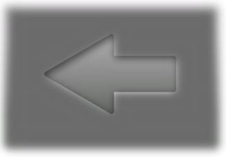
- You should have two shapes in Inkscape.


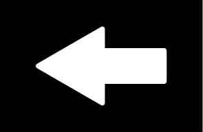
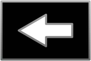
- Now, you have to get these into the GIMP. The easiest way is to take a screen shot. To do that, in GIMP, go to File -> Acquire -> Screen Shot. Take two shots. Crop one to the shadowed image and the other to the black and white.
- Pick the shadowed image and add an opaque layer mask. View the Layers dialog. Right click the “Background” layer and click Add Layer Mask…
- Pick the black and white image. Select the entire image and copy it.
- Pick the shadowed image and in the layers dialog, click on the mask, to the right of the image.
- Pick the shadowed image and paste. You should see something like the image below. Pick the move tool and drag the mask around until it exactly matches the shadowed arrow.

- Now, crop the image to the arrow shape.
- Right click on the floating layer and anchor it.
- Right click on the mask layer and apply it.
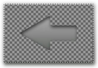
- Now, just save it! Remember to save it as a PNG so that the empty parts are transparent.

I hope this helps anyone else who needs more than the standard Android icons.
More updates:
Will S. created a wireless icon.
Great tutorial, and very easy to follow, thanks.
I made a wifi icon, which can be found here:
http://digitalsquid.co.uk/files/2009/08/wifiicon.png
(you can use it if you want)
Update
The Android developer site has some great icon guidelines now. I recommend taking a look. If you have Photoshop or another program that supports vector shapes and drop-shadows, you can see the proper settings there.
Nick says
… you can do the whole thing in Inkscape without having to go into GIMP, by using a clip mask.
Duplicate your arrow, then select both this and the inverse arrow and do Object > Clip > Set. The inverse arrow will be clipped to only show the content contained within the arrow shape.
Introduction
For my Android application, Green Mileage, I created a number input dialog box. One of the buttons in the dialog is a backspace key. Right now, it’s just a button that says, “Back”. When typing, it’s function is not immediately intuitive, so I wanted to replace it with an ImageButton. To skip to the example, scroll down. Unfortunately, none of the Android icons look quite right. I found an image of a red X and a trash can. Neither would look like a backspace, so I decided to create my own.
Since Android is open source, I assumed that Google would have created some kind of template for button images. I thought I would find a PSD, but after much searching, could not. Rather than pay $1,000 for Photoshop, I decided to use open source applications to create the image. Here’s how I did it.
Step 1: Get Inkscape and GIMP
Since this drawing will be made with vector graphics, it’s best to use a vector graphics program, so head on over to Inkscape’s web site and download it if you don’t already have it. The post-processing will be done in GIMP, so grab a copy of that too. Both have versions for Linux and Windows.
Step 2: Create the Inkscape drawing
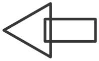
The points on the arrow should be evenly spaced, so they shouldn’t be drawn by hand. The arrow is really just a triangle with a rectangle dangling from its side.
- This tutorial is about drawing an arrow shape, but you can use most of these steps for any icon.
- First, let’s draw the arrow. Pick the polygon tool:

- In the toolbar at the top of the screen, set these values.
- Corners: 3
- Spoke ratio: 0.5
- Rounded: 0
- Randomized: 0
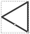
- In the drawing canvas click and hold. While holding the left mouse button, press and hold the control key. That will help you draw the triangle so that the right side is vertical.

- Select the rectangle tool and draw a rectangle for the right side of the arrow. Make it overlap with the triangle. Then, select both objects. In the menu bar, click Object -> Align and Distribute. Click the “Center on horizontal axis” button.

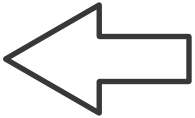
- Now, with both objects selected, in the menu bar, click Path -> Union.

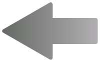
- Android menu buttons have rounded corners and gradient fills. Let’s apply those next. With the arrow selected, in the menu bar, click Object -> Fill and Stroke. Click the Stroke Style tab. Select the round join and set the width to a high enough value that the corners look rounded.
- Select the Stroke Paint tab and pick the linear gradient. The gradient will appear sideways, but we’ll fix it later. Click Duplicate to create an Android button gradient. Click Edit… Select the first stop at the top of the window, then at the bottom of the window, set its RGBA value to 666b66ff. Set the second stop to b2afb2ff.
- Select the Fill tab, create a linear gradient and set it to the one you just created for the stroke.
- Close the Fill and Stroke dialog.

- To rotate the gradient, click the gradient tool,
 .
.
- You’ll see two handles. Drag the lighter side to the top of the arrow and the darker side to the bottom. The handles will snap in to place.

- Android menu buttons also have an inner shadow. Make a copy of the arrow away from the original arrow and draw a rectangle around it. Make it a good amount larger. Align the rectangle and the arrow the same way the triangle and rectangle were aligned before. Then, select both the rectangle and the arrow and in the menu bar, select Path -> Exclusion. Set the fill of the new shape to black and the path to the same gradient as the arrow, ensuring that the gradient minimum and maximum are aligned to the arrow, not the box. Make a duplicate of the new shape and set it aside for use later.

- Select both the original and the new, inverse arrow and align them horizontally and vertically.
- Select the larger, inverse arrow and open its Fill and Stroke options, move the blur slider to the right until it looks like a shadow. Also adjust the alpha of the fill option until the arrow looks like it has an inner shadow. Don’t worry if the space outside of the arrow doesn’t look right. Then, since Android’s shadows are offset, move the inverse arrow down and to the right a bit. The arrow keys are good for this.

- Now, in the copy of the inverse arrow you made, set the stroke to white and the fill color to black.
Go to part 2
